Literature by Johan Framhout, articles on painting |
||||||||||||||||||||||||||||||||||||||||||||||||||||||||||||||||||||||||||||||||||||||||||||||||||||||||||||||||||
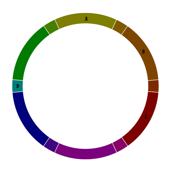
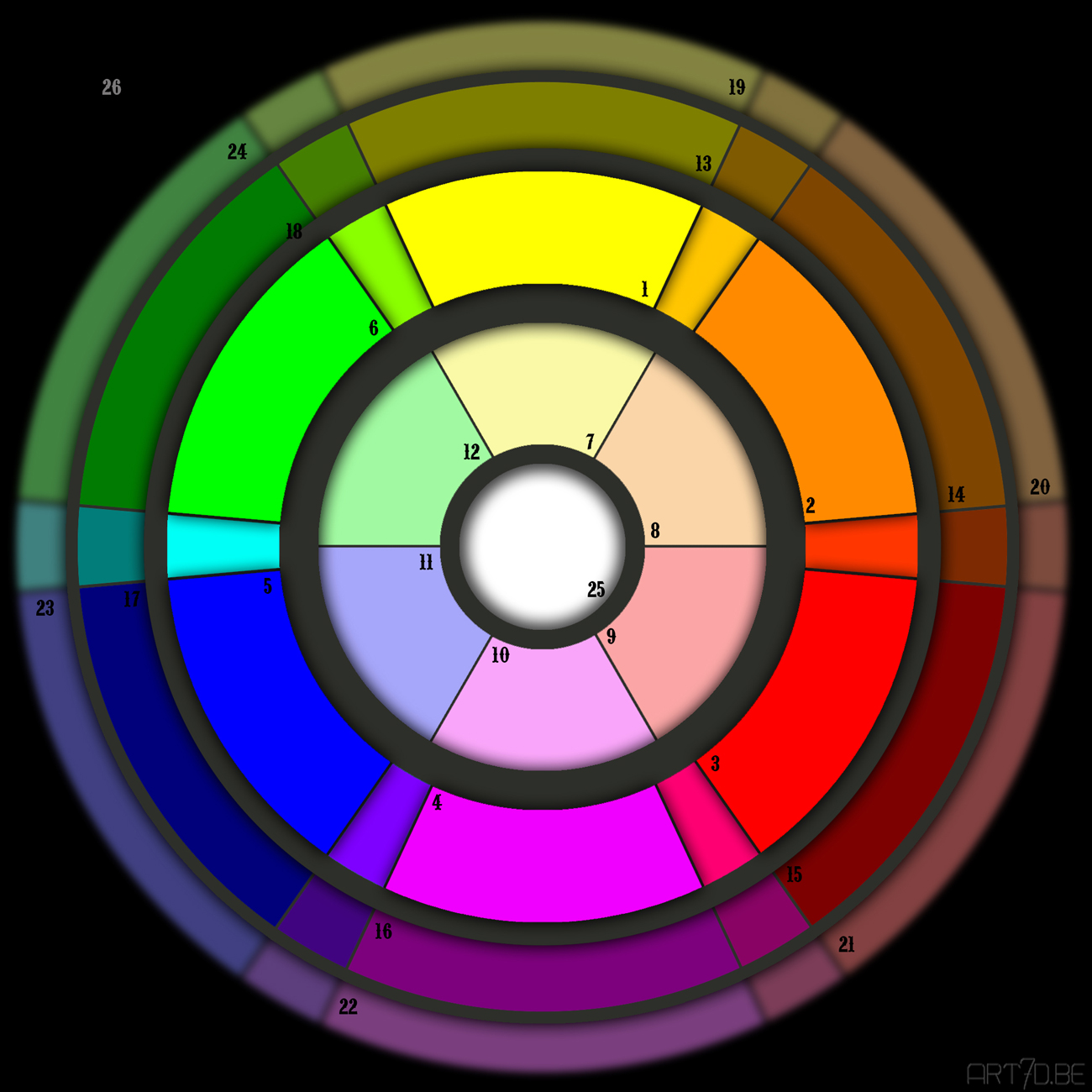
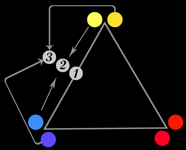
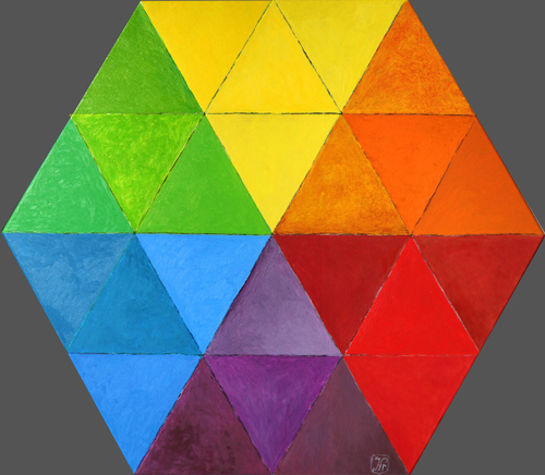
Colour tutorialFirst watch the ring on the left. Which name would you give to the colours A, B, C and D? We would chose to A: warm green or ochre green, B dark gold ochre or light brown, C red brown and for D bluegreen, also called turquoise. Physically this colours are however dark yellow (A), dark orange (B) and dark red (C). D is indeed bluegreen but is identical to the same place on our version of the colour circle on the right, there it seems rather a light blue! 11 is in fact light blue, but looks dark. Primary colours are 1, 3 en 5. We did prefer the version with the yellow on top because it shows the evolution from cold colours on the left to warm on the right. Of course all colours should be gradient, nevertheless we choose frames to give us a better insight in the colour spectrum. For a complete correct presentation a sphere should be used, the colours 1, 2 and 3 as well as everything in between could be a horizontal circle, with white and black as the Nord and South pole of the sphere, the exact middle being neutral grey. For practical reasons we did prefer to put everything on one surface, because a computer screen is still 2D. The outer ring shows the colours of the main ring mixed with grey.
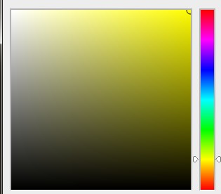
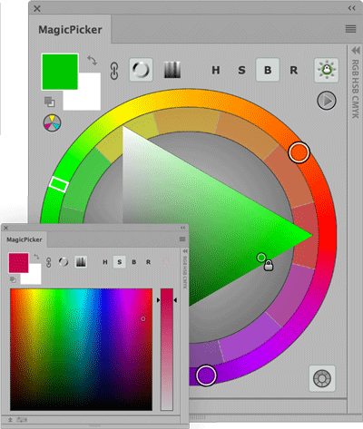
Our brain does not experiences colours objectively. The tones of the primary colours in our circle are the most intense on the computer screen, called the RGB colours (also the green and the violet are called RGB colours). However the blue (5) looks rather dark to us. In paints it is named middle blue. Although the colour on the left between the middle blue (5) and vived green (6) is bluegreen, it resembles more light blue. The three basic colours construct all other colours and tones, include black and white. In light white is the sum of the three primary colours, black the lacking of any light or colour. The three primary colours to light however are green, red and blue (with yellow being the mix of green and red). The printing of our colour circle is made with three basic colour pigments: yellow (1), violet (4) and blue (5). The pigment for the violet is called magenta, the printer creates vivid red with mixing magenta with yellow. Good printers have a colour more, the complete black. If one changes the mode from RGB to CMYK, the printer will additionally use that black pigment, because the RGB black of a print is not that perfect. There is no white pigment in the printer, white will be limited to the colour of the used paper. Paints however have different pure whites, more intense then any colour of paper). Here on the screen there is no white in the center of our colour circle (25), it is in fact a light gray. If it would be really white, the light coming out of the screen would blind the eyes. Colour tones are somewhat different from one screen to another, it depends on the colour card and the chosen clarity of the screen. On our colour circle 13 looks what it is, dark yellow, thanks to the pure colours standing beside it. The A in the picture on top is however identical to the colour 13 on the second picture. On the first illustration is shown in B how we experience 14 as a brown, but it is identical to the dark orange on 14. We used the ring on the left to make the illustration on the right, adding two inner and one outer ring. We do not have specific words in our vocabulary for the light tones of blue or green. On the contrary red with white we call pink, light violet is called lila. The name 'light red' however indicates a red closer to orange on the colour circle, not the pink. The name 'dark yellow' on paint tubes is the most yellow kind of orange, not the ochre green shown in A or 13. The light blue (11) on our circle is not our choise, it is the mathematic mixture of the computer's most vivid blue with white, still quite dark. Bluegreen is more recognisable in the ring of dark colours (between 17 and 18) instead of the main ring. Names as indigo, carmin, vermillion, purple and ultramarin are not colour names, but pigment names. Often used as if it where colour names nowedays, referring to an explicite tone. In that case ndigo is a very dark tone of blue, vermillion is red going to orange, carmine to violet. Purple is the blue violet as produced by the purple snale and ultramarin is the blue of lapis lazuli, nowadays made synthetically. Looking to the next illustration, the indexed colour on the right top of the square is RGB yellow. The middle of the right side is the dark yellow colour 13 on our colour circle. The precise middle of the square is always the corresponding colour in the outer ring. The tone on the upper edge, one thirth length form the 'pure white', has made our inner circle. A square is not the ideal represention (but very practical however) of colours, some pixels are repeated. The both corners on bottom for instance are the same 'total' black. The correct form of diagram would rather be a piece of pie, with the RGB yellow on top of the circle radius. The program Painter uses a triangle which is a more logic representation.
Each brand of artist's paint present their colour cart on the internet. But we cannot see those colours on our screen, because it is always transformed in the three basic colours of our computer screen. The printed colour carts are not very good too, although some brands use up to seven basic colours for their prints. If you want to see the real colour, you have to look at the colour cart in the shop where the real paint has been added on strips of canvas, if it exists. Artist's paint can have very intensive colours not to be seen on an electronic screen, although it doesn't seem that way. If you mix colours on the screen it will give an expected and logical result. Yellow and blue will give green, yellow and red will give orange... Mixing pigments however will not always give a predictable result. For example mixing a vivid blue with a vivid red does not end in a vivid violet. For that purpose one should take a vivid violet pigment. All factories are free to chose the name for their colours, so you must realise that the used name of the colour can be misleading. An top level artist's paint gives the number of the used pigments. Some are pure and some are mixed. Those numbers can be checked on the site of pigment numbers, the colour index of artiscreation.com. You can click on any pigment to see it's composition or fabricage and ASTM lightfastness. Which pigments are more reliable? Generaly one could say the nonorganic pigments last for centuries to come, while the organical are more futile. So little organics where used by the best painters. Much saints on old fresco's now have olive green faces because the organic pink faded away while the underpaint of green clay did stay. However the Southamerican maya blue, made of indigo on palygorskite clay, remained as blue as 6000 years! And indigo was made of plants untill 1870. Carmine, coming from female insects called Coccus cacti, has also stayed quite good from gothic times until now, having become a bit brown.To make deep red, a thin layer of cochineal was led over vermillion. Alisarin crimson was a lake made from plants and did not maintain. Nowedays alisarin crimson is often copied with a thirth branch of pigments, the petrochemical group. Petrochemical colours are organic. Their lightfastness is sometimes I, a lot of them are II or worse. Inorganics where originally digged pigments, later on augmented by chemically made colours, such as viridian, Prussian blue, later on cadmiums and cobalts. So it is not always an improvement when famous pigment factories have changed their cadmiums and cobalts into petrochemicals. They may still call it cadmium or cobalt, but if you check the pigment numbers it is revealed they are not. Prussian blue is nowadays often a petrochemical replacement, as well als Naples yellow. Naples yellow was originally a lead pigment, lead antimonate yellow pyrochlore (PY41), a colour that cannot be replaced by a hue. It is commonly known that lead, cadmiums and cobalts are toxic pigments, There are safety warnings and they should be followed. But for artists cadmiums and cobalts cannot be missed. Cobalts and cadmiums are always cat. I, very opaque and as basic layers they stand on the second place after digged minerals and leads. Petrochemicals are transparant. Lead, cadmium and cobalt in small amount, are natural, while their petrochemical replacements are a pollution for the environnement. Rublev produces a lot of oil paints with ancient pigments. However synthetic iron oxides have the same lightfastness as the digged pigments. Moreover petrochemical pigments not only replace but also create new brilliant colours such as quinacridone, phtalogreen and blue, lightfastness cat. I. Cadmiumred is a perfect and very reliable red in different tones, always opaque. Titanium white and zinc white, two environnement polluters, are now quite common and of excellent lightfastness. Titanium white is quite durable, but has it's limits. For use of ground layers lead white is much better. For colour mixing lead white is also often more suited, because titanium white is so strong and opaque it is dominating in mixture. Lead sulpate has been popular once, under the name 'non-toxic lead white', it could also be a mixture of lead sulphate and other whites. Titanium should be made in the right way, the rutile process. Zinc white is excellent in watercolour, but has been a disaster in oils. Painted layers of zinc white turns into a kind of glass during the years, jumping of the canvas in shatters. If oil is painted over acrylics or acrylic gesso, zinc white should even never be used as part of a mixture (except on top layer), nor any colour containing zinc oxide. Even the slightest amount in mixture still behave the same way.
Colour mixing with oils and acrylicsGeneral principle four colour mixing in oils and acrylics. We can on ly show this colours here in approaching RGB colours.
With oils and acrylics colour mixing is not exactly according to the colour circle. Secundairy colours can be mixed with primary colours, but the result is not that pure. You can obtain a better result by placing two colours at the main poles in a bit different tinting. Yellow has become here a lemon yellow and a middle yellow. There is now a red with orange tint and one with purple tint. Also a blue that is a bit greenish beside a reddish blue. We show green as an exemple. Number one stand for the perfect brilliant green pigment. Number two is your mixture with poles standing closest. With number three the result is a more dirty, muddy green, greyish and brownish. There are several ways of mixing. As working layer upon layer, the upper layer is a more transparant glacis of a colour wrubbed out with a harder brush. In pointillism colour dots where placed beside each other. Severini painted colour lines. Other mixing is wet-in-wet, or just mixing on the palette before use. Johan Framhout, November 2018 |
||||||||||||||||||||||||||||||||||||||||||||||||||||||||||||||||||||||||||||||||||||||||||||||||||||||||||||||||||
|
||||||||||||||||||||||||||||||||||||||||||||||||||||||||||||||||||||||||||||||||||||||||||||||||||||||||||||||||||
Our article about colour pigments is placed in the 'History of modern art" |
||||||||||||||||||||||||||||||||||||||||||||||||||||||||||||||||||||||||||||||||||||||||||||||||||||||||||||||||||
Study of oil colours seen on screen
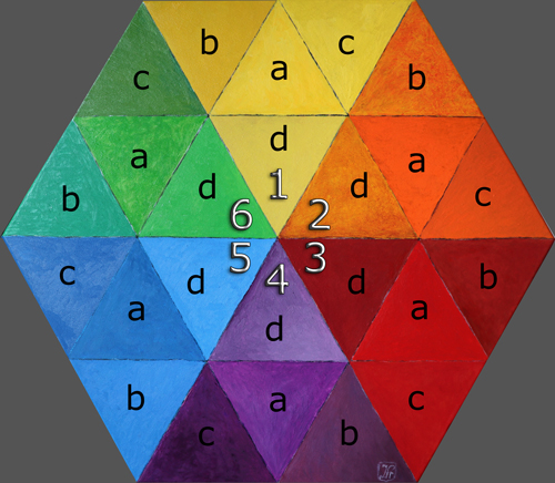
Painting, oil on six sided canvas. The six segments where painted with the main colours yellow, red and blue (1, 3 and 5), in between the complementary colours (2, 4 and 6). Each large triangle is subdivised into four smaller ones. With different pigments each time four tints where painted, not too different from each other, but clearly not the same either. We took a picture from the painting. Next the painting was placed beside the computer screen to compare the photo, which was digitally adapted as good as possible. The image above is the adapted version, that below the unadapted photo provided with numbers. First a general consideration, about the difference between pigments and computer screen. Ignore promotions such as 'this program offers you 5000000 colours'. A computer screen works with three colours of light, forming each tint you can see. Humans have the capacity to distinguish about 100000 tints. Internet is limited by 240 colour tints. Other tints are created by placing different colour pixels together. The color intensity we see in paint cannot always be shown on screen. Most obvious examples are white and black. Black is when you have no light on the screen. But the screen will always reflect the surrounding light. White is the total light, which is not shown, since it would blind you. So white is replaced on screen by light grey. One same adaption for the whole painting was not possible. The six large triangles (1 to 6) had to be adapted seperately (with blue also this was not possible). Next all 24 small triangle where adapted in a different way. The adaptions where level, saturation, colour balance, contrast, and even adding of a layer with brilliant yellow, putted in the modus 'colour', opacity changed, to mix with the photo. All used materials where of top quality: computer, screen, graphical chart and reflex camera, in ideal circumstances, daylight. The amount of level change needed was strikingly different each time. The painted version proved to be more bright in colour than the adapted photo. With increasing the saturation of yellow there was clearly a limit. At a certain level all brush structure disappeared. Same problem with orange and red. With blue there was no problem with intensity but it was not possible to reproduce the exact tint. Green and violet (6 & 4) proved to be in the middle between the intensity problem of the warm colours (1,2 & 3), and the unreachable tints of the blue (5). In general the digital version proved to be more uniform than the painting, the colour of the small triangles (a to d) are more resembling each other. Also generally here and there the brush strokes where less visible on the digital version. Green 6c brought an opposite transformation, the brush structure was augmented. The blue 5c proved to be the most difficult to imitate (genuine prussian blue with titanium white). Johan Framhout, 18 november 2019 |
||||||||||||||||||||||||||||||||||||||||||||||||||||||||||||||||||||||||||||||||||||||||||||||||||||||||||||||||||
Tabel with some petrochemical colour pigments NR = not rated bij ASTM, wc = watercolors, o = oil, a = acrylic, py = pigment yellow
|
||||||||||||||||||||||||||||||||||||||||||||||||||||||||||||||||||||||||||||||||||||||||||||||||||||||||||||||||||
|